|
|
Post by Valerioch on Sept 20, 2014 11:19:51 GMT 1
|
|
|
|
Post by littlebluefoot on Sept 20, 2014 11:22:26 GMT 1
 At least this thread has a link!
|
|
|
|
Post by SamHarvey on Sept 20, 2014 11:22:49 GMT 1
D
|
|
|
|
Post by littlebluefoot on Sept 20, 2014 11:23:57 GMT 1
Crikey, I thought there would be more of a difference between the badges but if you were hungover and tired, you would probably not even notice the changes between A-D!
|
|
|
|
Post by littlebluefoot on Sept 20, 2014 11:25:33 GMT 1
C for me, I like the fact that FS is in a different colour, but would prefer the 1886 back in white! I really, really don't want much!
|
|
Deleted
Deleted Member
Posts: 0
|
Post by Deleted on Sept 20, 2014 11:28:51 GMT 1
Agree, not much of a difference but they are all good and infinitely better than clip art shat!
|
|
|
|
Post by Throbbing Gristle on Sept 20, 2014 11:31:04 GMT 1
A or C, I don't like how the 1886 is split up on B and D.
|
|
Deleted
Deleted Member
Posts: 0
|
Post by Deleted on Sept 20, 2014 11:32:18 GMT 1
I've gone B, but I like the look of all apart from C.
This vote is purely down to aesthetics.
|
|
|
|
Post by atcham jack on Sept 20, 2014 11:32:49 GMT 1
not moaning about lack of choice, just glad to have loggerheads back. I go for B but the other 3 are fine. I like the numbers either side.
had hoped Isthmus of river and shrew but too complicated and expensive. well done the club. where and how do we vote please.
Our new CEO Matt Williams is doing a splendid job, club shops, badges, more use of stadium, Hospitality deals. so much income raised on the quiet to support income. most impressed with him, MM and staff and Mr Shrewsbury himself, Roland Wycherley. thank you all.
I will try and park well away from the Bentley on 11.10.14! Floreat Salopia!
|
|
|
|
Post by Chic on Sept 20, 2014 11:58:43 GMT 1
Wow..
Is this the best we can come up with!
At least we have the loggerheads..
|
|
|
|
Post by neilsalop on Sept 20, 2014 11:59:21 GMT 1
All a bit samey to me. Surely the ones in the project that someone did a year or so ago were better. Not trying to put a downer on things, but personally I'm a little underwhelmed with the choices.
|
|
|
|
Post by mattmw on Sept 20, 2014 12:05:12 GMT 1
Like a or c but think both work better if the text colour is all the same, would give it a better look and be easier to use in black and white.
Like others I'm slightly surprised at the simplicity of the design. Great as the loggerheads are I was expecting there to be something a bit more included such as a different back ground or additional images to meet the copyright rules. Would be interested to know which design company has produced them?
The question remains why these designs weren't looked into 7 years ago? If they are copyrightable now they were then - nice as they are it's hardly a massive leap from the old loggerheads to this one. Did no one from the club actually investigate this at the time?
|
|
Deleted
Deleted Member
Posts: 0
|
Post by Deleted on Sept 20, 2014 12:05:35 GMT 1
All a bit samey to me. Surely the ones in the project that someone did a year or so ago were better. Not trying to put a downer on things, but personally I'm a little underwhelmed with the choices. Always trying to put a downer on things arnt you  |
|
|
|
Post by davycrockett on Sept 20, 2014 12:10:05 GMT 1
I would image the similarity is more to do with manufacture and cost re. colour ways, different sizes not to mention copyright... Cant see the point of a vote as nothing much between them but all more than acceptable  One slight concern though is if we choose and copyright C whats to stop others making 'counterfeit' merchandise with A Well at least we haven't had to pay for anyone to design these. |
|
Deleted
Deleted Member
Posts: 0
|
Post by Deleted on Sept 20, 2014 12:13:26 GMT 1
Wow.. Is this the best we can come up with! At least we have the loggerheads.. For what it is worth I suggested at the meeting last week that a superb badge designed by a fan that incorporated all the old badges within the design be submitted. However time constraints, possible copywriting issues and a dose of pragmatism got me over ruled by a majority. |
|
Deleted
Deleted Member
Posts: 0
|
Post by Deleted on Sept 20, 2014 12:13:29 GMT 1
This will be met with the usual, 'some people are never happy' and 'why are you moaning, we've got the loggerheads back', but I'm extremely underwhelmed by this. If you're going to change something, do it properly. The club have essentially chosen the badge they want, then made subtle differences to create the illusion the fans are picking the design. Most of the badges on this page are better than the designs put out today. Fans designsWhilst it is fantastic to have the old 'heads back and the very welcome addition of 'Floreat Salopia', putting it inside the same basic template of the old badge makes it hard to leave the clip art legacy behind. If I had to make a choice of those 4, it would be A. The top two Loggerheads on B and D are too close together, and personally the Floreat Salopia in a different colour to Shrewsbury Town Football Club looks a bit daft. Could we not have had one with all the writing in Amber? And for a final moan, the font is too big around the outside, it just dominates. How much better does this look than the designs released by the club today? 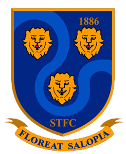 |
|
Deleted
Deleted Member
Posts: 0
|
Post by Deleted on Sept 20, 2014 12:17:38 GMT 1
Today I have mainly voted (A) .
|
|
Deleted
Deleted Member
Posts: 0
|
Post by Deleted on Sept 20, 2014 12:27:38 GMT 1
underwhelmed by those choices, but at least we have the Loggerheads back.
|
|
|
|
Post by neilsalop on Sept 20, 2014 12:29:00 GMT 1
This will be met with the usual, 'some people are never happy' and 'why are you moaning, we've got the loggerheads back', but I'm extremely underwhelmed by this. If you're going to change something, do it properly. The club have essentially chosen the badge they want, then made subtle differences to create the illusion the fans are picking the design. Most of the badges on this page are better than the designs put out today. Fans designsWhilst it is fantastic to have the old 'heads back and the very welcome addition of 'Floreat Salopia', putting it inside the same basic template of the old badge makes it hard to leave the clip art legacy behind. If I had to make a choice of those 4, it would be A. The top two Loggerheads on B and D are too close together, and personally the Floreat Salopia in a different colour to Shrewsbury Town Football Club looks a bit daft. Could we not have had one with all the writing in Amber? And for a final moan, the font is too big around the outside, it just dominates. How much better does this look than the designs released by the club today? The only thing I can say is that the badge over the years has evolved and getting the loggerheads back was the major stumbling block. Now they're back the is no reason why in a few years time the badge can't evolve again into something like one of the fan designs, hopefully in shape of a shield rather than the unoriginal round designs that we're being offered at the moment. |
|
|
|
Post by ThrobsBlackHat on Sept 20, 2014 12:29:29 GMT 1
I don't like the Amber floreat salopia in C.
I like B or D but don't think either will win, because they are pretty well indistinguishable and so will split that vote.
Any of them is a vast improvement though.
|
|
|
|
Post by SeanBroseley on Sept 20, 2014 12:33:12 GMT 1
Wow.. Is this the best we can come up with! At least we have the loggerheads.. This. The low bar set by the current badge has been surpassed. But it was clipped on the way and is rattling. |
|
|
|
Post by Bob Rickerton on Sept 20, 2014 12:40:01 GMT 1
It does seem kind of odd offering a vote on 4 badges that look so similar. They're all fine, and it'll be great to have the loggerheads back, but do any of them match this for quality? 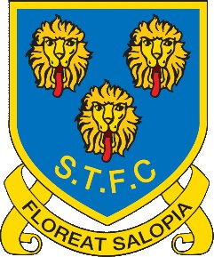 |
|
|
|
Post by atcham jack on Sept 20, 2014 12:40:11 GMT 1
do wish the club had allowed us to submit designs and whittled it down to say 6. I will not moan but it all appears to be done quick and on the cheap. the next thing after the vote is to submit suggestions for the most saleable regalia. once clipfart tat sold on cheap in Darwin centre, club shop and online/ebay.
one final point on the badge, I would have preferred a shield shape. apart from that Town, well done, but the drawing board or another patch beckons.
|
|
sssalop
Shropshire County League
Posts: 89 
|
Post by sssalop on Sept 20, 2014 12:41:35 GMT 1
Well done to the club for at last opening it out to all of us, so we get a badge we can feel an affinity to. Everyone's a designer so there will be lots of ideas and moans about the detail but the four the club are offering are all acceptable because we get the loggerheads back. Vote for A!
|
|
|
|
Post by davycrockett on Sept 20, 2014 12:43:56 GMT 1
Be interesting to hear from those on the FP who held a meeting ' to discuss possible designs' ......
Why are they all so similar, was this the FP's decision?
|
|
|
|
Post by huggybear on Sept 20, 2014 12:45:44 GMT 1
Really quite bland.Too many designs similar.Something like Badges produced by Chris Smith based on Old Supporters Club Badge, With Modified writing around edge would have been good. Good to see Logerheads back.
|
|
|
|
Post by roberto02afcct on Sept 20, 2014 12:59:23 GMT 1
Option B for me. Reason will be the whole clip art stuff
|
|
Deleted
Deleted Member
Posts: 0
|
Post by Deleted on Sept 20, 2014 13:10:51 GMT 1
I like the round design, always have done. I just feel that the Loggerheads doesn't look right in the round shape.
A or B for me I think. Dislike C with the Amber Floreat Salopia.
.
|
|
|
|
Post by TheFoz on Sept 20, 2014 13:19:04 GMT 1
C for me!
|
|
|
|
Post by SouthStandShrew on Sept 20, 2014 13:20:42 GMT 1
B.
|
|


 At least this thread has a link!