|
|
Post by Dan F on Jun 11, 2007 15:37:31 GMT 1
And what dodgy merchandise there did seem to be wasn't even using the loggerheads for that matter, Stutty!
But don't say he didn't do any work. He put the circles around it...
|
|
|
|
Post by Namur on Jun 11, 2007 15:39:19 GMT 1
designers are t*****s. they sit on their fat arses all day doing sweet f.a. it probably took someone a couple of hours maximum to design our new logo, why else do you think they wrote that article about the bullsh!t "concept" of the badge - it's to cover their backs and make you think that they actually put some effort into it. designers are con artists, they abuse the fact that they have a bit of computer knowledge on photoshop and that most other people don't, something which may look "cool" or "stylish" was probably created with a few clicks of the mouse. The FACT (and it is a fact) that they stole the image from clipart is an absoulte p**s take and, if they aren't already, the club should be hugely embarrassed and should've withdrawn the badge immediately. This is not the first time this lion has been used in shrewsbury for a bad pice of design, if you look at the sign on the Cop, just above Barracks Passage, for the Lion & Tap you will notice the same gormless looking lion. I did 1 year of design at uni but quit because it wasn't challenging at all, for all my coursework i left it all until the last minute - stole research from the internet, messed around on photoshop for about an hour and wrote a load of bullsh!t about the concept and design of it, handed it in and got a good grade. This is what these design companies do, they're just a bunch of lazy f***wits who are conning people out of thousands of pounds, just look at the olympics logo or the tories' new logo which someone described as "that looks like something my 5 year old daughter could draw". death to design companies rant over You reckon? I've worked in the print industry (briefly), and my dad has been a graphic designer for over 30 years. I've seen how they work first hand, and they certainly do not sit on their arses all day. What's up, got sour grapes because you couldn't land a job in a studio? They ahven't got time to sit around with all of the pushy sales staff and deadlines. Still doesn't excuse the clipart lion or the London 2012 'logo' though... |
|
|
|
Post by mattmw on Jun 11, 2007 15:42:02 GMT 1
so you are agreeing that the loggerheads isn't usuable as a copyrighted logo for the club? This is the information we have from the club so we have to accept that. But that doesnt mean that the new crest is any good. Also, I do not think the club needed to change from the current badge to be honest. How much, if anything, did they loose out on at Wembley? The biggest game in Town's history and I doubt very much they they lost out on a vast amount of funds from other vendors. I certainly didnt see a great amount of fans with owt sold from the street vendors... I'd be interested to hear ball park figures on how much having a copyrighted logo will benefit the club financially over a non copyrighted one. I think the vast majority of fans buy their kits, merchadise etc direct from the club or an apporved supplier anyway. Its only when we get to Wembley or something similar that the "unofficial" items start appearing. The same goes for sponsors/corporate connections that club has. I could see the logic behind having a copyrighted design, if we were Man U or even Wolves, but just wonder if its really necessary at a club like ours. The new design may even put off people buying official items from the club, but go for unofficial ones with the loggerheads on. Will be really interesting to see how the new merchadise and kit with the new logo sells - if it doesn't will they revert back? |
|
|
|
Post by ianwhit on Jun 11, 2007 15:42:45 GMT 1
personally (note this bit!) i think it's perfectly acceptable. designers over the years have used a pallette at their disposal to create a finished piece of work. stone, parchment, quills, various dyes etc have all been used.. claxton created a press that used standard type faces and revolutinised mass printing.
in the digital age the designers palette is extended to a whole lot of other things.. fonts, clip arts, colours etc, etc.
the stfc logo is a composite of many different elements, the lion, the shape, the lines, the fonts, the words, the colours etc.
you could have a go at the designer for using a certain font but no one has, so why the uproar about using a clip art that has been cleared as part of the logo which has gone through the copyright search process and passed every hurdle to become a copyrighted logo which is wholely owned by the club
|
|
|
|
Post by stuttgartershrew on Jun 11, 2007 16:03:31 GMT 1
I doubt whether any other club in professional football has ventured to the web for a clipart to form the basis of their new club crest. And I think the vast majority of supporters understand why that is the case... I can understand designers needing inspiration but the new crest is, I suspect, nothing but a clipart taken from a quick search for 'Lion' on the web or in a Microsoft application and its so close to the original that its laughable. Like I say, as a supporter I want something that is ours and ours alone and something that is associated with the club. For me the clipart lion does not do that. We'll agree to disagree our kid...  |
|
|
|
Post by ianwhit on Jun 11, 2007 16:08:30 GMT 1
we can disagree but the clip art is actually from a library which costs quite a bit and just happens that microsoft have licensed to have that image in their clipart for office which costs about £300ish.
|
|
|
|
Post by Steve Rogerson on Jun 11, 2007 16:12:16 GMT 1
we can disagree but the clip art is actually from a library which costs quite a bit and just happens that microsoft have licensed to have that image in their clipart for office which costs about £300ish. That's part of the problem Ian, it isn't new. It is a piece of art that has been knocking around for years. |
|
|
|
Post by bobbyc on Jun 11, 2007 16:16:15 GMT 1
we can disagree but the clip art is actually from a library which costs quite a bit and just happens that microsoft have licensed to have that image in their clipart for office which costs about £300ish. SO WHAT if it’s licensed? I have no doubt stfc have every right to USE the lion. However that doesn’t make it acceptable. Think about: Chelsea’s lion Man united’s devil Forest’s tree Derby’s ram Etc etc …these are all concepts that no doubt can be found on clipart. Imagine if Nottingham forest just used a clipart image of a tree! Even STFC’s old shrew: for all its faults, at least it was unique, and someone actually went away and designed it, just for the club. As others have said on this thread, the more you actually think about it, the worse this logo gets. I’m going to have to stop thinking or I’ll lose my mind… |
|
|
|
Post by Mediolanum Shrew on Jun 11, 2007 16:22:01 GMT 1
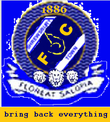
Leopards - I read somewhere that traditionally in heraldic terms Lions cannot be called Lions. Therefore all lions are Leopards.
County Badge is Leopards, and funny enough Shropshire CCC changed their logo from 3 Leopards to 1 Leopard!
New badge is growing on me. The issue is the Clipart story. People who dont like the new badge have jumped on the bandwagon because of the clipart issue.
I love the old badge, but it's this simple. It you dont like. Dont buy it. Stop whinging. The choice is yours. I'm sure if there is a market for it, others will produce merchandise with the old crest on. Funny enough Man City are calling their old crest - a retro crest, so there are ways and means to make money, and satisfy everyone. And lets face it with us lot thats hard ;-)
|
|
|
|
Post by Mediolanum Shrew on Jun 11, 2007 16:26:05 GMT 1
I doubt whether any other club in professional football has ventured to the web for a clipart to form the basis of their new club crest. And I think the vast majority of supporters understand why that is the case... I can understand designers needing inspiration but the new crest is, I suspect, nothing but a clipart taken from a quick search for 'Lion' on the web or in a Microsoft application and its so close to the original that its laughable. Like I say, as a supporter I want something that is ours and ours alone and something that is associated with the club. For me the clipart lion does not do that. We'll agree to disagree our kid... The main issue is that the change was explained as a need for copyright. So when the blokes down the pub discuss it and you say to them, ah it's a copyright issue, they point to a clipart image that anyone can download and say, well how can you copyright that. If that can be explained fully, I think half the argument over the new logo will be answered. |
|
|
|
Post by ThrobsBlackHat on Jun 11, 2007 16:48:23 GMT 1
anyone can also download a font but no-one seems to be up in arms about that.
The letters used for the lettering were not individually handcrafted by the designer - they bought the right to use them and made the necessary adjustments.
The lion used for the logo was not individually handcrafted by the designer - they bought the right to use them and made the necessary adjustments.
Shrewsbury Town, STFC, 1886, The colours, the circles, the Lion all come together to make something which is unique.
I am almost certain if you looked at other signage / written documents you would find the same font being used by other people, heck, it might even come free with Microsoft packages...
They ran the copyright checks on it and it passed - so they copyrighted it and that is done.
There is no more or less of a copyright issue on the text itself than there is on the image, in fact, I would wager that the image, having changed colour, had the colour inverted from the original and put on a different background is actually more unique than the lettering.
WHAT! I hear you cry! Some designer has spent ages developing that script and now the club's designer is ripping them off by using it on our badge? Why didn't our designer design his own font, and make brand new text that would make it really ours?
|
|
|
|
Post by ianwhit on Jun 11, 2007 16:55:53 GMT 1
we can disagree but the clip art is actually from a library which costs quite a bit and just happens that microsoft have licensed to have that image in their clipart for office which costs about £300ish. That's part of the problem Ian, it isn't new. It is a piece of art that has been knocking around for years. bit like the loggerheads ;D |
|
|
|
Post by bobbyc on Jun 11, 2007 16:59:46 GMT 1
FONT??! who cares about the font?!
it's the f-ing lion design we're bothered about.... stop trying to divert the issue!
|
|
|
|
Post by Browny on Jun 11, 2007 17:19:40 GMT 1
This is the information we have from the club so we have to accept that. But that doesnt mean that the new crest is any good. Also, I do not think the club needed to change from the current badge to be honest. How much, if anything, did they loose out on at Wembley? The biggest game in Town's history and I doubt very much they they lost out on a vast amount of funds from other vendors. I certainly didnt see a great amount of fans with owt sold from the street vendors... I'd be interested to hear ball park figures on how much having a copyrighted logo will benefit the club financially over a non copyrighted one. I think the vast majority of fans buy their kits, merchadise etc direct from the club or an apporved supplier anyway. Its only when we get to Wembley or something similar that the "unofficial" items start appearing. The same goes for sponsors/corporate connections that club has. I could see the logic behind having a copyrighted design, if we were Man U or even Wolves, but just wonder if its really necessary at a club like ours. The new design may even put off people buying official items from the club, but go for unofficial ones with the loggerheads on. Will be really interesting to see how the new merchadise and kit with the new logo sells - if it doesn't will they revert back? I wanted to know that a while back, |
|
|
|
Post by blueandamber on Jun 11, 2007 17:24:24 GMT 1
Is our new badge worse than the shrew logo we used to have?
Whatever our logo is, not everyone will like it.
Anyone can tell that it represents Shrewsbury Town FC because of the lion and the year we were formed on it.
Its in Blue and Amber.
It could be worse.
|
|
|
|
Post by Steve Rogerson on Jun 11, 2007 17:39:22 GMT 1
That's part of the problem Ian, it isn't new. It is a piece of art that has been knocking around for years. bit like the loggerheads ;D Now you are being silly. The loggerheads logo has a tradition within the town and county, that lion doesn't |
|
|
|
Post by creature on Jun 11, 2007 17:59:31 GMT 1
This is good, from the "International Civic Heraldry Website" - seems a little confused... "SHROPSHIRE Origin/meaning : The leopards' faces in these arms were adopted by the County Council in 1895 from the Borough of Shrewsbury (Azure, 3 leopards' faces Or). It is only in the incorporation of the ermine that the County arms differ from those of the Borough. The heads appear on the fifteenth century seal of the Corporation but their origin is unknown. They may have been derived from the Royal Arms, or from the Arms of De La Pole, Earls of Suffork in the fourteenth century (Azure, a chevron, and three leopards' faces Or), or arms of some local family. The heads are often referred to as "the loggerheads". This originates presumably in the practice of carving some such motif on the head of the log used as a battering ram. " "SHREWSBURY AND ATCHAM Origin/meaning : The arms are a combination of the lion heads of the old Shrewsbury coat of arms and the badge of Atcham (bridge). " Still don't like the new badge, it has lost the defining elements of the club badge such as Man U's devil, the Liver Birds etc. Interesting bit in TBH's post is the colours mentioned - have we got it all wrong and should be playing in blue and gold?  |
|
|
|
Post by nicko on Jun 11, 2007 18:20:25 GMT 1
We can talk about, clip-art lions, copyright issues, brands and making money as much as we want.
The fact remains that the logo says nothing about the Club, who we are and where we are from.
I will not buy anything with that logo on.
|
|
|
|
Post by bob the builder on Jun 11, 2007 18:24:34 GMT 1
This is an interesting discussion actually - what is a Loggerhead? "Pimbley's Dictionary of Heraldry" www.digiserve.com/heraldry/pimb_l.htm"Lion - The lion is the most popular beast in heraldry. He appears in the arms of Great Britian, Denmark, Spain, Holland, Bohemia, Saxony and numerous lesser countries. As early as 1127 Henry I used the lion as an ornament on a shield. Of the 918 bannerets of Edward II, 225 bore lions. The early English heralds seem to have confused the lion with the leopard. While never drawn spotted as the real leopard, he was described in most attitudes as leo-pardé, or a lion as a leopard." Has STFC actually made good a mistake of an early English herald?!! the badge is crap, no consultation with the supporters and now we have the club no engaging with supporters over it and are you employed by the club throb!!! why is it you do the bidding of the club?? |
|
|
|
Post by Hippo on Jun 11, 2007 18:38:08 GMT 1
If you were told to design something with a lion, found something exactly how you imagined it, had it cleared to use, and then could make the necessary alterations, would you not use it? rather than just drawing the exact same thing again, but slightly different? What would be the actual point? Saying anybody can just download it and change it to amber aren't correct, because it's copyrighted. Like, i can't download the same font as f.c.u.k use, and put it on a tshirt saying that, just because it's there and available. It's not legal to produce counterfeit merchandise whatever it is. They've copyrighted STFC too (haha, swindon).
This loggerhead thing doesn't particularly concern. I'd say, looking at the old badge, about 90% of people would say they actually were lions in the first place. There's just as much evidence as not to say that a loggerhead is a lion rather than a leopard anyway.
Not too keen on the actual lion bit when you see it on here, but stitched i reckon (hope) it might look alright. My main issue with it is the way it pointlessly says STFC, rather then simply SHREWSBURY TOWN FC, with the year centralised.
If you say you think it looks sh!t - which i do - then fair enough, but is the fact that it's a manipulated bit of clipart that much of an issue? How do you actually know that the villa one, or whoever the other clubs were, aren't just images from specialist designer software that the person has then adapted for the club?
|
|
|
|
Post by jaytee on Jun 11, 2007 18:51:39 GMT 1
I still hate the sodding thing. If we had to change, I would have preferred two lions (or leopards), on their back legs facing each other. If they'd have asked the fans, I'll bet they wouldn't have come up with that head taking up the whole centre of the badge. I'll still buy a shirt though, but I could understand someone who didn't.
|
|
|
|
Post by RuytonShrew on Jun 11, 2007 18:51:59 GMT 1
Have to say I agree with Welshshrew from earlier in this thread. After quite a few weeks it hasn't grown on me at all. The loggerheads in all the various guises we have had them over the years have at least been distinctive - this is not.
As well as the terrible lion, I'm still also bugged by it saying Shrewsbury Town across the top and STFC underneath. It looks like the designer has just shoved that in at the bottom to fill some space.
|
|
|
|
Post by blueandamber on Jun 11, 2007 18:52:44 GMT 1
The fact remains that the logo says nothing about the Club, who we are and where we are from. Apart from Shrewsbury Town FC, 1886 and the lion which represents us as being part of Shropshire. Along with the blue and amber. ? |
|
|
|
Post by stuttgartershrew on Jun 11, 2007 19:32:03 GMT 1
The font used...  Superb lads, superb... |
|
|
|
Post by kuliloach on Jun 11, 2007 19:36:59 GMT 1
We can talk about, clip-art lions, copyright issues, brands and making money as much as we want. The fact remains that the logo says nothing about the Club, who we are and where we are from. I will not buy anything with that logo on.  It is not the best badge in the world neither is it the worst, isn't it time everyone gave it a rest? |
|
|
|
Post by robshrew1984 on Jun 11, 2007 19:47:43 GMT 1
I will not buy anything with that logo on. Thats a bit sad isn't it??? Do you support the club implicitly or only buy their products as long as it caters to your tastes specifically??? Do you go into Marks & Spencer and complain because they don't make shirts exactly how you want them???
|
|
|
|
Post by AndyShrew2007 on Jun 11, 2007 19:51:52 GMT 1
 imagine what would happen if this club was in administration... or a Boston situation.. people would be jumping off the English bridge 
|
|
|
|
Post by neilsalop on Jun 11, 2007 20:03:45 GMT 1
Won't buy anything with the new logo ( it's not a badge IMO ) for myself, however if my daughter wanted something I would buy it for her, as kids like her are the future of the club and if they want to show their support they should be encouraged to do so.
|
|
|
|
Post by SeanBroseley on Jun 11, 2007 20:04:28 GMT 1
Its more important to go to games than buy the latest shirt. £35 is two games for me and the youngster at the Gay Meadow (although it won't be at the New Meadow of course).
|
|
handsoffmeadowenjoyment
Guest
|
Post by handsoffmeadowenjoyment on Jun 11, 2007 20:20:06 GMT 1
I detest the new corporate logo,not just the lion but also the stfc bit and especially the font I thought that I wouldn't be buying the new shirt but it doesn't look that bad www.a-lineshop.co.uk/item.do?item=135 |
|