|
|
Post by Chic on Sept 20, 2014 13:21:02 GMT 1
For what it is worth I suggested at the meeting last week that a superb badge designed by a fan that incorporated all the old badges within the design be submitted. However time constraints, possible copywriting issues and a dose of pragmatism got me over ruled by a majority. I think the design was mine! At least it had one vote.. |
|
|
|
Post by suttonshrew on Sept 20, 2014 13:25:54 GMT 1
Hi guys, no matter what I say here I'm sure I'll get shot down. Of the fans who attended last weeks meeting it was felt that this design worked best. Of the alternative designs out in their were either issues with copywrite, how they would look scaled up or scaled down or it's was just the fact people didn't like them. In our discussions the biggest sticking point was over where the 1886 stood and the colour of the text, which is why various alternatives have been given. The club wanted a circle, for various reasons, main one being copywrite and cost. Matt and the chairman have been very open on this.
Of the badges above, the loggerheads was never an option due to copywrite and the river loop it was felt wouldn't scale down very well to go on merchandise. That didn't come from the club, it came from discussions last week with fans.
Given the time constraints we wanted 4 things on the badge, 1886, floreat salopia, club name and most importantly the loggerheads.
Hope this all makes sense, the sp have done as much as we can to get a badge we and supporters who attended the meetings were happy with so I hope you all support us and vote
Cheers
Mike
|
|
|
|
Post by Bob Rickerton on Sept 20, 2014 13:31:47 GMT 1
Thanks for that, Mike. It's disappointing that the shield won't be returning, but that's not to knock yours and the rest of the SP's efforts, which have been stellar.
|
|
Deleted
Deleted Member
Posts: 0
|
Post by Deleted on Sept 20, 2014 13:34:16 GMT 1
Quite frankly those designs are appalling.
The three loggerheads do not sit naturally in a circle......awful!!!
This is like looking at the appalling choice we were given for the current home shirt .
This is being rushed through when there were many alternatives that were more imaginative.
Come on Town you can do better than this
|
|
|
|
Post by stuttgartershrew on Sept 20, 2014 13:41:25 GMT 1
Given the time constraints we wanted 4 things on the badge, 1886, floreat salopia, club name and most importantly the loggerheads. Was about to say the same thing our kid. I'm slightly surprised by the response on here. Everything I wanted included in the badge (the Loggerheads, Floreat Salopia, 1886) are included. I like that that's about it too, that's what we have included. Why included anything more and clutter it up? Not that bothered about a round badge at all and if that's what the club wanted then cool. So with that in mind, what has been put together and agreed on pretty much hits the mark for me. It is a badge that includes everything we need. Its who we are, the year we were formed, the coat of arms and motto of the town the club represents...job done. Plus of course it is a million times better than the clip art.  By the by, D for me. Love the contrast with the blue, amber and white 1886. |
|
|
|
Post by neilsalop on Sept 20, 2014 14:08:21 GMT 1
Hi guys, no matter what I say here I'm sure I'll get shot down. Of the fans who attended last weeks meeting it was felt that this design worked best. Of the alternative designs out in their were either issues with copywrite, how they would look scaled up or scaled down or it's was just the fact people didn't like them. In our discussions the biggest sticking point was over where the 1886 stood and the colour of the text, which is why various alternatives have been given. The club wanted a circle, for various reasons, main one being copywrite and cost. Matt and the chairman have been very open on this. Of the badges above, the loggerheads was never an option due to copywrite and the river loop it was felt wouldn't scale down very well to go on merchandise. That didn't come from the club, it came from discussions last week with fans. Given the time constraints we wanted 4 things on the badge, 1886, floreat salopia, club name and most importantly the loggerheads. Hope this all makes sense, the sp have done as much as we can to get a badge we and supporters who attended the meetings were happy with so I hope you all support us and vote Cheers Mike While I'm not in a position to argue with those who were there I wish you had come up with a few more different designs. They really come across as a compromise and although a vast improvement on the comedy lion none of them actually inspires me. I will buy some stuff with the new badge, whichever one is chosen, but I would have been more likely to buy more stuff if there was a better badge. I am grateful for all your work to get us to where we are today, but please don't think that the choice today will be our badge forever. As I stated earlier badges evolve and although this is a good starting point it is not the end. |
|
|
|
Post by WATR on Sept 20, 2014 14:13:20 GMT 1
I'm normally one of the people who are straight on the clubs back about things but I'm genuinely impressed with the designs they've put forward here. They have all the elements I'd want in a club badge. OK, I'd prefer a shield but it's not a deal breaker.
Some of the fan designs are interesting concepts, but I prefer the uncluttered nature of the clubs designs. The fact the clip-art aficionado mortgagehound thinks that they are "apalling" is the cherry on the top for me.
|
|
|
|
Post by ThrobsBlackHat on Sept 20, 2014 14:31:14 GMT 1
Quite frankly those designs are appalling. The three loggerheads do not sit naturally in a circle......awful!!! This is like looking at the appalling choice we were given for the current home shirt . This is being rushed through when there were many alternatives that were more imaginative. Come on Town you can do better than this As someone who said you loved the current badge, forgive me for raising a wry smile. |
|
|
|
Post by atcham jack on Sept 20, 2014 15:30:08 GMT 1
not too sure there is room in the circle for a cherry on the top. I agree with the sentiments of mortgagehound but am happy to go with what is on offer, B as a preference. at least we have the Loggerheads back.
I suspect the new badge may be improved in a few years time on some future rebrand and where more money is available. in the meantime proud to wear any of the 4 on offer on my new shirt when available.
still think cherry on top has a place somewhere. LOL!
|
|
|
|
Post by davycrockett on Sept 20, 2014 17:43:28 GMT 1
Still feel it would have been better for one of the 4 chosen plus 3 others that were on offer and let the fans decide rather than the SP to make the decisions and then give us 4 similar to choose from. But thats just my personal opinion along with it all being rushed.... Do agree with mike though that we would have had this debate whatever choices were made and all 4 are acceptable choices. C for me |
|
|
|
Post by Catalyst Cartel on Sept 20, 2014 17:48:53 GMT 1
Why a circle though, why not a shield?
|
|
|
|
Post by stuttgartershrew on Sept 20, 2014 17:54:40 GMT 1
Why a circle though, why not a shield? Only guessing here but maybe because the council has them in a shield. Maybe it helps us with the copyright question to have them positioned in something different. Not sure like, haven't got a clue about this sort of thing but could be the reason... |
|
Deleted
Deleted Member
Posts: 0
|
Post by Deleted on Sept 20, 2014 18:00:24 GMT 1
So who is going to be the first to say "I'm not buying anything with that badge on"  ? |
|
|
|
Post by mattmw on Sept 20, 2014 18:00:31 GMT 1
Why a circle though, why not a shield? Being cynical I'd say its so the new badge can be stuck over the old one quite easily to make the change over cheaper! The Designs just look like the loggerheads has replaced clippy and the text has been moved round a bit. Not really a rebrand more a five minute design job. Really would be helpful if the club could publish full details of the brief they gave the designer. As others have said most designers normally produce 3-4 different designs for their client, and them tweak the chosen one. In this case they have just submitted 4 versions of the same design which is a little lacking in imagination |
|
Deleted
Deleted Member
Posts: 0
|
Post by Deleted on Sept 20, 2014 18:27:15 GMT 1
For what it is worth I suggested at the meeting last week that a superb badge designed by a fan that incorporated all the old badges within the design be submitted. However time constraints, possible copywriting issues and a dose of pragmatism got me over ruled by a majority. I think the design was mine! At least it had one vote.. Looking at your avatar it was. Top work mate and I appreciated how you incorporated the old badges in the design. Definitely my favourite from those on show. |
|
|
|
Post by TonyKellysBelly on Sept 20, 2014 18:53:42 GMT 1
What I'm about to say is probably going to get me shot down too!!
The 4 choices we now have to change our current club badge and get rid of the clip art lion once and for all is a result of months of hard work for everyone involved in the supporters Parliament, we have negotiated with the club, working closely with initially Martin James and more recently Matt Williams.
There have been times when Mike and I had to be restrained in our response to some posts on B&A and comments from certain individuals. We are now in a much better place than a few months ago, we have an agreement from the club they the badge will change, we now have some designs that reflect our history, our club and not a clip art lion. We as supporters have had a say in that decision.
It does disappoint me somewhat that now we have sight of the choices some people want to challenge those choices, all I can say to you is everyone has had a chance to voice their opinions and thoughts, we have had numerous open meetings of the SP and attempted to keep everyone informed of progress. The 4 designs we have to choose from will not change, the SP are happy to answer any questions on the badge as openly as we can however the choice of designs will not change now.
The designs were chosen to include
1. Identity of the football club - Shrewsbury Town Football Club
2. Floreat Salopia
3.1886
4. The 3 Loggerheads
5. The four colours of the club are used.
6. We can achieve copyright.
If you have any questions whatsoever you can contact either myself, Mike Davis, Glyn Price or Ollie Warner
Roger
|
|
Deleted
Deleted Member
Posts: 0
|
Post by Deleted on Sept 20, 2014 19:30:44 GMT 1
A b or d for me.
Not keen on the amber floreat salopia in c.
However any of them are a million times better than clippy.
As for the circular design, while i would have preferred the shield, it is a small compromise to get rid of the current shambles of a badge.
|
|
Deleted
Deleted Member
Posts: 0
|
Post by Deleted on Sept 20, 2014 19:34:14 GMT 1
I would love to hear the views of some professional designers on these four almost identical designs.
What is presented is a new design shoe horned into the old design.
Lots of designs have been put forward that incorporate the clubs history that are infinitely better.......what happened to these suggestions?
|
|
|
|
Post by stuttgartershrew on Sept 20, 2014 19:40:43 GMT 1
The designs were chosen to include 1. Identity of the football club - Shrewsbury Town Football Club 2. Floreat Salopia 3.1886 4. The 3 Loggerheads 5. The four colours of the club are used. 6. We can achieve copyright. The only thing I would recommend is to lose the black in the Loggerheads detail. Doesn't do the design any good at all in my opinion. Forces everything else to the background. It were the same on those patches I had made up. If I were to do them again the black would be moved out for a blue. Pedantic like but it's all the detail... |
|
|
|
Post by differentcoco on Sept 20, 2014 19:58:07 GMT 1
Given the time constraints we wanted 4 things on the badge, 1886, floreat salopia, club name and most importantly the loggerheads. Was about to say the same thing our kid. I'm slightly surprised by the response on here. Everything I wanted included in the badge (the Loggerheads, Floreat Salopia, 1886) are included. I like that that's about it too, that's what we have included. Why included anything more and clutter it up? Not that bothered about a round badge at all and if that's what the club wanted then cool. So with that in mind, what has been put together and agreed on pretty much hits the mark for me. It is a badge that includes everything we need. Its who we are, the year we were formed, the coat of arms and motto of the town the club represents...job done. Plus of course it is a million times better than the clip art. Couldn't agree more!
There is no pleasing some people on here
|
|
|
|
Post by TonyKellysBelly on Sept 20, 2014 20:00:18 GMT 1
Mortgagehound
All designs and opinions were put forward and the four choices were those that the SP and club felt were most reflective of the most popular designs and thoughts of fans.
It disappoints me that all of a sudden there are challenges on the choices when there has been plenty of opportunity for everyone to have their views put forward.
I'm not aware that you attended any of the meetings about the badge, if you did then I apologise, if not, then you missed your chance.
|
|
unclebob
Midland League Division Two

Posts: 128 
|
Post by unclebob on Sept 20, 2014 20:04:25 GMT 1
I suppose going from clip art to copy and paste is a move forward this is just the loggerheads pasted in the clip art frame. Some of the fan designed ones were much better. Sorry id some are disapointed with the reaction but isnt the idia for fans to honestly give their views? For my money, these are all the same design with 4 varyations not 4 designs. I do hope it develops over years as none look right.
|
|
|
|
Post by SeanBroseley on Sept 20, 2014 20:09:58 GMT 1
All the designs put the loggerheads back on the shirt where it belongs. An overdue move. That will get me back into the club shop. Because they all do that they fulfil the minimum requirement.
In my view none of them go beyond that. None have the "wow factor" that would have been the result of a creative reworking of the loggerheads which could have been the result of professionally worked designs. I would like Shrewsbury Town to aim for excellence in this matter, as in others. But I am used to it not doing so and have grown comfortable with that. I'm fine with it.
By the same token I will not be voting for any of the designs.
|
|
|
|
Post by Liam on Sept 20, 2014 20:15:55 GMT 1
All the designs put the loggerheads back on the shirt where it belongs. An overdue move. That will get me back into the club shop. Because they all do that they fulfil the minimum requirement. In my view none of them go beyond that. None have the "wow factor" that would have been the result of a creative reworking of the loggerheads which could have been the result of professionally worked designs. I would like Shrewsbury Town to aim for excellence in this matter, as in others. But I am used to it not doing so and have grown comfortable with that. I'm fine with it. By the same token I will not be voting for any of the designs. Sums up my thoughts pretty well. However, I don't want to carp too much as this is a victory, the club have listened, and a lot of people have worked hard to get us here. One further thing I don't understand though: why do all four of the designs retain clippy's navy blue trim? That's never been one of our colours at any point in our history. |
|
unclebob
Midland League Division Two
Posts: 128
|
Post by unclebob on Sept 20, 2014 20:35:03 GMT 1
Mortgagehound All designs and opinions were put forward and the four choices were those that the SP and club felt were most reflective of the most popular designs and thoughts of fans. It disappoints me that all of a sudden there are challenges on the choices when there has been plenty of opportunity for everyone to have their views put forward. I'm not aware that you attended any of the meetings about the badge, if you did then I apologise, if not, then you missed your chance. So If you dont live locally enough to make it to a meeting shut up? If you work long hours, shut up? If you dont have transport shut up? If you are unable to make the meetings for any reason you dont deserve a view? You sure that is what you ment? |
|
|
|
Post by Catalyst Cartel on Sept 20, 2014 20:43:23 GMT 1
Mortgagehound All designs and opinions were put forward and the four choices were those that the SP and club felt were most reflective of the most popular designs and thoughts of fans. It disappoints me that all of a sudden there are challenges on the choices when there has been plenty of opportunity for everyone to have their views put forward. I'm not aware that you attended any of the meetings about the badge, if you did then I apologise, if not, then you missed your chance. So If you dont live locally enough to make it to a meeting shut up? If you work long hours, shut up? If you dont have transport shut up? If you are unable to make the meetings for any reason you dont deserve a view? You sure that is what you ment? Spot on not everyone is available during the week, can we have a SP meeting on a Saturday morning of a match or even after a match? Sent from my C5303 using proboards |
|
|
|
Post by floreatsalopia1 on Sept 20, 2014 20:51:01 GMT 1
This will be met with the usual, 'some people are never happy' and 'why are you moaning, we've got the loggerheads back', but I'm extremely underwhelmed by this. If you're going to change something, do it properly. The club have essentially chosen the badge they want, then made subtle differences to create the illusion the fans are picking the design. Most of the badges on this page are better than the designs put out today. Fans designsWhilst it is fantastic to have the old 'heads back and the very welcome addition of 'Floreat Salopia', putting it inside the same basic template of the old badge makes it hard to leave the clip art legacy behind. If I had to make a choice of those 4, it would be A. The top two Loggerheads on B and D are too close together, and personally the Floreat Salopia in a different colour to Shrewsbury Town Football Club looks a bit daft. Could we not have had one with all the writing in Amber? And for a final moan, the font is too big around the outside, it just dominates. How much better does this look than the designs released by the club today? 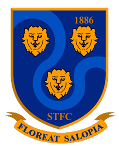 I downloaded this badge to show my son and family the badge I liked from the supporters designs. I assume the club prefer a round badge so they can stick the new round crest over the old one in areas such as around the stadium? !! I too think it is a poor show to criticise those not attending a meeting.The need for speed should not over ride the need to get it right this time. Sorry but that is my opinion. I will prefer any new badge with what is proposed. But do not pretend this isn't being rushed when a shield badge could have been included in the vote. |
|
unclebob
Midland League Division Two
Posts: 128
|
Post by unclebob on Sept 20, 2014 20:54:01 GMT 1
So If you dont live locally enough to make it to a meeting shut up? If you work long hours, shut up? If you dont have transport shut up? If you are unable to make the meetings for any reason you dont deserve a view? You sure that is what you ment? Spot on not everyone is available during the week, can we have a SP meeting on a Saturday morning of a match or even after a match? Sent from my C5303 using proboards Pretty sure he didn't mean to say it that way, probly frustrated with the responce |
|
|
|
Post by mattmw on Sept 20, 2014 21:12:26 GMT 1
What I'm about to say is probably going to get me shot down too!! The 4 choices we now have to change our current club badge and get rid of the clip art lion once and for all is a result of months of hard work for everyone involved in the supporters Parliament, we have negotiated with the club, working closely with initially Martin James and more recently Matt Williams. There have been times when Mike and I had to be restrained in our response to some posts on B&A and comments from certain individuals. We are now in a much better place than a few months ago, we have an agreement from the club they the badge will change, we now have some designs that reflect our history, our club and not a clip art lion. We as supporters have had a say in that decision. It does disappoint me somewhat that now we have sight of the choices some people want to challenge those choices, all I can say to you is everyone has had a chance to voice their opinions and thoughts, we have had numerous open meetings of the SP and attempted to keep everyone informed of progress. The 4 designs we have to choose from will not change, the SP are happy to answer any questions on the badge as openly as we can however the choice of designs will not change now. The designs were chosen to include 1. Identity of the football club - Shrewsbury Town Football Club 2. Floreat Salopia 3.1886 4. The 3 Loggerheads 5. The four colours of the club are used. 6. We can achieve copyright. If you have any questions whatsoever you can contact either myself, Mike Davis, Glyn Price or Ollie Warner Roger Work of the SP has been great in this and it's great things have moved on so quickly since the vote. Just wonder if its possible to disclose the name of the company that designed these logos and what their brief was. Just from experience working with designers in the past its odd they have provided the club with four near identical logos? The six items listed would seem to give scope to a wider range of logos to be produced |
|
|
|
Post by ThrobsBlackHat on Sept 20, 2014 21:15:15 GMT 1
Mortgagehound lives in Southport doesn't he?
Some of the meetings had 24 hours notice.
I'll go head to head with him on many issues but I don't think you can throw that at him.
I understand people in the SP are disappointed by some of the negativity, but my advice would be to just keep your heads down and get on with it.
In a month we'll have a great new badge. It won't be anyone's number one choice, but it'll be an improvement for everyone.
|
|


 ?
?


